


What is the real benefit level in Australia?
A story of many deflators

Recently we provided a few thoughts about benefit rates in Australia based on available data - one post that explained ideas and another that visualised things. But one request I’ve had is to show a few more plots about benefit rates - specifically if I could show the real benefit rate. But what is real?
We had plots of “income replacement rates”, but as we noted in the post there are a variety of ways we may view what a mimimum income standard are - some that reflect an absolute standard and some that reflect a relative standard.
Given that, I thought it might be useful to pop a few of these below and discuss what they mean. Like the prior posts we’ll stick to the “JobSeeker Payment Single Rate” as i) it is simple to look at ii) it is the rate people are currently discussing as needing to be changed.
However, remember that we will miss a lot of interesting stuff by doing so. We won’t capture:
Changes due to the tax system (“net” incomes),
Changes due to supplementary support such as Commonwealth Rent Assistance,
Changes due to adjusting eligbility criteria and movements between the relative benefit systems (other payments, other family types).
If you are interested just yell out, and we can return to some of these things in the future!

Benefit rates in absolute terms
When we look at historic benefit rates provided by DSS we can see that the number of dollars paid has increased over time - rising from $108.40 in December 1987 to $408.45 as of March 2024.
But over that time prices have gone up as well. In this way, if the provision of a benefit was to make sure someone could afford to purchase a certain number of goods and services - in order to have sufficient income support to live - this benefit would need to rise in line with those prices.
So how can we take that into account? Well we can deflate the income measure by the amount prices have risen - to measure whether the amount people can purchase has risen or fallen.
So lets set all prices to their FY2012 level.

Cool. We have actually done this two different ways in the plot above - and we can see that both change the story behind the “nominal” weekly payment figure.
While payments have gone up through time, they have - until COVID - only really increased by the rate of price growth. That is why these adjusted figures are “flatter” than the weekly payment amount.
We can see that this measure of the absolute value of benefits had been roughly unchanged since the mid-1990s by comparing the real payment rate to the average between 1989 and 2019.

Furthermore, since growth in the CPI was lower than growth in the LCI between 2000 and 2010 this implies that the real purchasing power of someone receiving the unemployment benefit had been declining during the early 2000s.
Now lets zoom into the following period:

Zooming into the post-2012 period we can see that the LCI and CPI adjusted measures tended to move together. Furthermore, there was one temporary big bump up in unemployment benefit payments (COVID supplement) and two permanent bumps up (the increase at the end of the COVID supplement and the increase in last years Budget).
So the real benefit is now higher. But is this the right way to measure a minimum standard of income support for individuals in Australia?
Over time labour incomes rise. As a result, a standard that simply back sure that individuals can buy a fixed amount of goods and services will become less effective in two ways:
Reservation wages and labour market bargaining: As individuals are less well insured against job loss it will reduce their bargaining power in the labour market, making individuals who might rely on such support more vulnerable.
Social interaction and stigma: As average incomes rise society expects individuals to spend more on certain things - school trips, social activities, clubs, social communication. If individuals who fall into hardship are now further away from average income, their ability to interact with others is restricted with a consequential impact on their networks and wellbeing.
For this reason people often talk about income replacement rates.
Benefit rates in relative terms
So we did this one a bit in the previous post with this image:

So they’ve dropped through time and have come back up.
But I wanted to put up an R script where everyone could pull the data and play with things (it is at the bottom), and when doing this I was too lazy to include a bunch of tax calculations. As a result, lets zoom in a bit and consider gross replacement rates.
To start I’m not going to do a replacement rate graph - but instead stick to the same “deflating” ideas from above. What if we deflate by the amount average earnings have increased rather than the amount prices have increased?
If the goal is to hold someones “relative position” fixed, rather than the amount they can buy, then this will be a bit more instructive.

So prior to COVID, the benefit was rising more slowly than growth in either average earnings, or the average earnings of a FT worker. This is why these lines are below the “real payments” line that adjusts for changes in prices.
Post COVID the increase in benefits has exceeded growth in earnings for full time workers and the average worker - partially due to an increase in the base rate, and partially due to benefits being inflation protected during a period of high inflation (and relatively low wage growth).
So what does this mean for replacement rates?
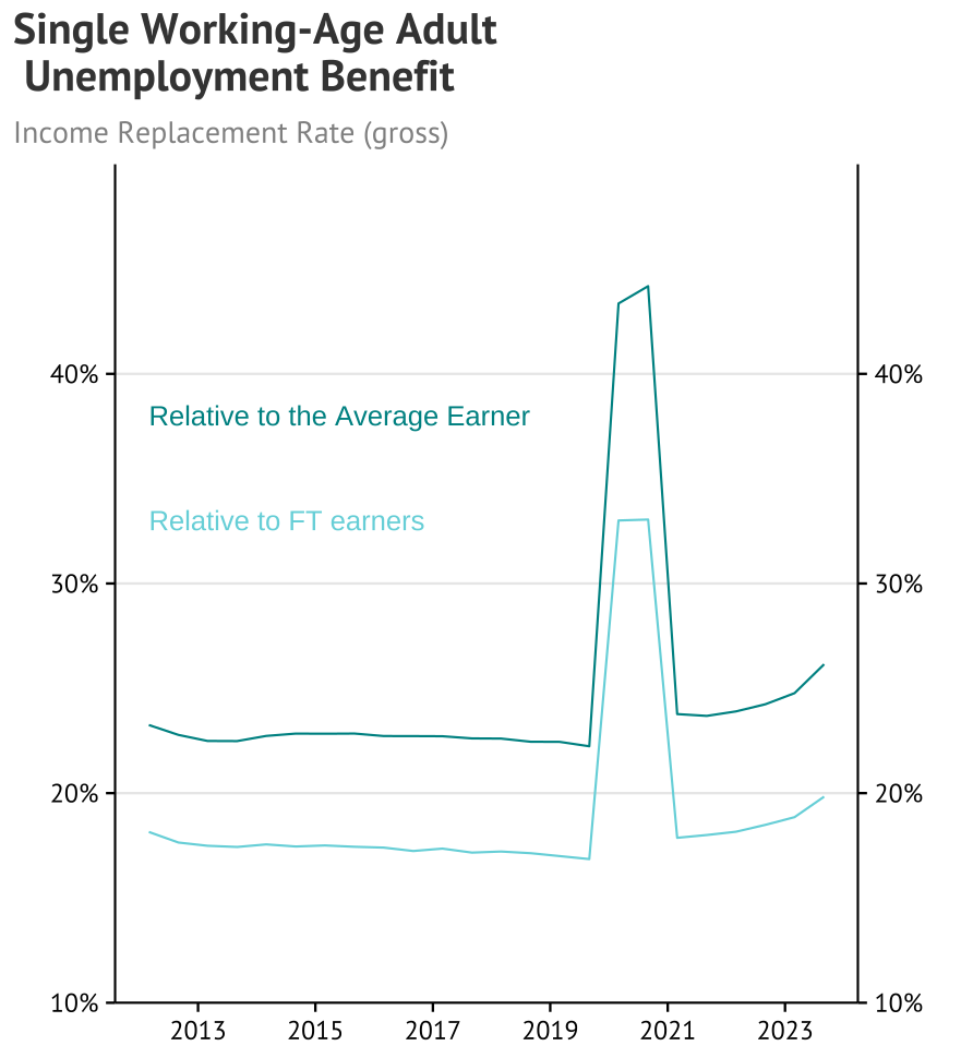
Unlike the net replacement rate above this one is a little less choppy, as the changes in the tax system don’t turn up. We can see that, in gross terms, a single individual on the benefit receives (through the base payment) 20% of the average full-time earners income and over 26% of the earnings of the average employee.
Both of these are higher than the replacement rates in the years prior to COVID.
Are these numbers high or low? Well it depends what we mean by that - and likely depends on the circumstances and opportunities for the individual.
Compared to other countries these replacement rates are low for someone who was recently made redundant - but also compared to most countries these income payments are average to high for someone who has been out of work for several years.
The fact is that the system in Australia (and Australiasia) is a bit different.
If you want to have a bit more of a look yourself, here is the starting point for pulling the data you need and making the plots from this post. It uses the beautiful theme61 package from e61, so definitely feel free to give that a look!
I will probably dig around a bit more myself in the future as well, so if you have any ideas just throw them in the comments below :)