


Some graphs about benefit rates

Hello travellers from the other post! My apologises for splitting this into two - the post was long, and Substack didn’t like all the pictures.
But as benefits are an important topic to get right I didn’t want to skimp on graphs, so here we are.
As a reminder, in the prior post we were discussing the criteria to analyse benefit payment changes. Armed with that we now wanted to go to the data - a process that has influenced my thinking on payment changes, and is hopefully useful for you.

Fiscal outlay
To give some perspective to the budgetary significance of unemployment benefits, we can look at the relative size of expenditures on these benefits as a proportion of the budget. For this, we can look at both the PBO historical budget files (thanks Lachlan Vass for sharing the link) and the AIHW write up about them.

For unemployment benefits $14bn was spent in the 2022/23 year. 2.2% of total Federal outlays. Apologises for the excel graph from Table 7 of the MYEFO - my R packages somehow corrupted when I put this data in!
So increasing the overall payment to all individuals receiving a payment by 5% (a $38 increase in the base rate for our single friends) will increase this outlay by $0.7bn (an overstatement there may be some payment specific operations expenditure included in this line item - but an understatement as unemployment is currently low).
But one second, what about if people are not taking up the payment because it is low? Lets have a look at receipt numbers over time.
Here we can look at benefit numbers from DSS (and also some work discussed here). Our prior work has indicated that the trend in JSP numbers might be a bit misleading - as there have been definitional changes between payments. So lets look at all of the payments grouped together.
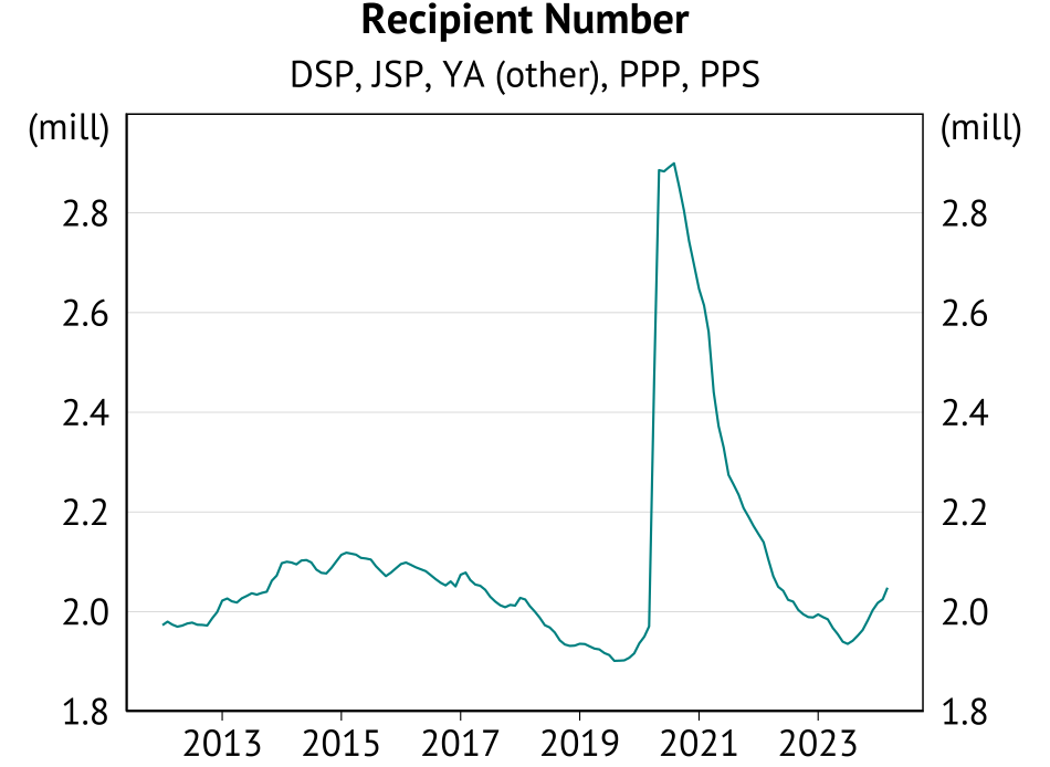
So if the higher payment alone saw recipient numbers go back to their annual average level in mid-2015 (the height of the mining bust), we would expect at most an additional 4.3% recipients relative to March 2023. Lets round this up to 5% as well, and we end up with an additional $1.4bn of spending.
Do I think this is convincing way of defining likely benefit numbers due to a higher benefit payment - no way, receipt was higher because unemployment was! Do I think the expenditure will likely be smaller as a result - yes.
But given I said my bias was toward an increase in benefits, the goal is to make things hard on myself.
Having made assumptions to make our scheme expensive, should a $1.4bn outlay concern us? That is tough - what is the alternative use of the funds?
One perspective is that, when we are discussing similar one-off outlays to business lobbyists from sexy industries like quantum computing and annual commitements to film subsidies that are around $400m such spending should be seen as publicly reasonable no ;)
I am of course being a bit sarcastic. A $1.4bn outlay would take up an additional 0.2% of the government budget each year. The decision to do so should be taken seriously. And I am sure that Budget 2024 documentation will show the real cost of any change is lower. But let’s be consistent about our application of fiscal restraint.
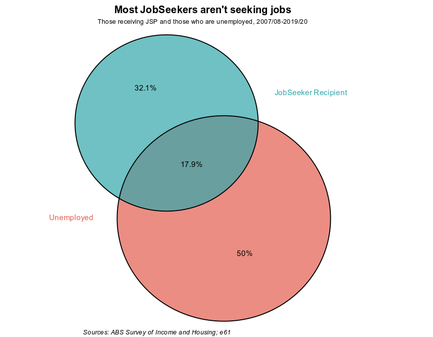
Note: Also remember, only a quarter of unemployed people receive the JSP (and half receive some support) - the payment is substantially targeted on the basis of low income. As a result, it isn’t clear that this type of increase in recipient numbers would occur!
Current generosity
The Economic Inclusion Committee report made a big deal of the gap between the JSP and the Aged Pension. This is true … in part. The Aged Pension is a payment for those deemed no longer able to work - like the DSP. I like the way this issue has been discussed in New Zealand by Brad Olsen, and similar gaps between similar payments have likely appeared here.
However, the JSP is temporary support for those who can work. In that way there is a rationale for a lower payment rate relative to age and disability support (although note the issue of partial capacity to work as a complication). In the NZ context the initial Social Security Act explained the difference in payment rates on this basis, and I’m sure similar logic held in Australia.
So instead we can think about this in terms of both history and other countries. We will stick to the single person rate - as commentators point to this being the area where there is an issue.
When doing this we will compare “replacement rates” rather than how much people are given - this means i) we are asking how much people receive relative to the average earner in a country ii) since Australia is bloomin rich, in most country comparisons an Australian income support recipient receives a similar absolute income even though it is lower as a share of average income.

Looking at the OECD numbers people keep sharing in the media I noticed a problem - Australian data only goes until 2022, and so the recent increases aren’t included. So I’ve added a rough plot of my own that is based on different things (i.e. 100% of weekly FT net earnings vs the rate a single person receives ex supplements - so the removal of the LMITO influences the base and increases the replacement rate). These are quick and nasty number - so use with caution - but by this measure net replacement rates are back to their early-2000s levels prior to any Budget 2024 hike.
Other measures may show less of an increase - but even with this lift, income replacement rates are still below the levels common through the 1990s (and before).
But how do replacement rates compare across countries? Below we have the OECD tool - Australia in red, OECD average in black. The first graph shows income replacement 2 months after job loss, the second graph 2 years after.
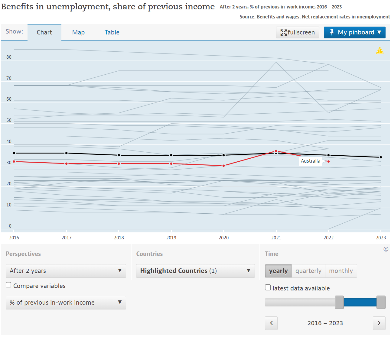
Even though the data is out date, the “short-term” unemployed replacement rate will still be well below the OECD average. However, the replacement rate for those out of work for 2 years is similar (and much higher for 5+ years). This is because other countries reduce payments the longer people are out of work.
This is a key distinction here - the Australian and New Zealand systems aren’t “insuring income” for those who have temporary job loss, unlike systems overseas. However, this is a bit of a separate question than the rate of the payment …
Coming back to the payment rate we can also ask how much JSP recipients need to cut back their spending when they lose their job - to get an idea of the financial strain they face. Sharing an updated plot based on Clarke etal (2023) we have found that they do have to cut spending significantly and persistently (noting this is estimated prior to the post-COVID benefit increases):

Labour supply
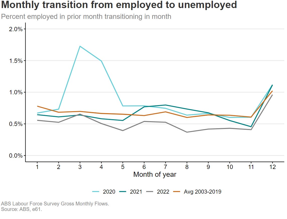
The labour supply responses to benefit payments are a fraught and difficult issue. To try to tease out part of this response (does benefit abatement make people work less) we looked at bunching in earnings for benefit recipients - and found no response. Similarily, it has been difficult to observe much of a participation response for shocks such as the surge in JobSeeker during COVID (Borland 2020) - as outside of the initial COVID shock itself transitions out of work looked pretty historically normal.

We outlined some of the reasons to be careful with these arguments here, but such limited responses to increased effective tax rates may suggest that financial incentives are not the big driver of time out of work.
Not so fast though!
The bunching work needs to be read in conjunction with the systems that are in place - understanding how EATRs and EMTRs change following the adjustment in benefit rates will be important for understanding what types of job arrangements will become more or less favourable. It may be that the labour supply responses are more complex than a simple bunching analysis will tell us - and it is the relationship between these and employment services, as argued by Wilkins and Herault, that matters.
Furthermore, in Luo and Nolan (forthcoming) we use a search and matching model to understand the implications of a 10% benefit increase. We find little effect on unemployment or labour market flows at current levels. But if the benefit level was already similar to the replacement rate in the US, a 10% increase would significantly increase unemployment. Note: This work will be out later this year, but if anyone wants to see initial results just flick me an email.
As a result, labour market responses depend on how generous the benefit already is.
Sum this up already!
Putting this all together, we could reasonably argue that labour supply effects would not be large right now - and that the “lower than the 1990s” replacement rates may suggest that we have historically been comfortable with paying for, and accepting changing in employment behaviour, associated with more generous support.
But given the changes already taken in Budget 2023 the argument is not as strong as last year. Furthermore, we also shouldn’t just use that argument every Budget ad nauseam. The right level of support should be based on a clear understanding of the trade-offs, and a public discussion of what we deem to be the right trade-off to accept.