


Why is labour participation so high in Australia?

A while back we chatted about how different labour force participation trends are in the US relative to the rest of the world. However, it’s a bit weird to be an Australia based blog and not ask similar questions about Australia. After having a good chat with my work colleague Zach Hayward and no doubt borrowing a bunch of insights I think it would be a good time to chat about it now.
So what is going on with Australian labour force participation?
tl;dr Growing participation by older workers and women has bucked some nasty looking trends - in a similar (but more pronounced) way that most other countries have. This gives the following key chart of what has contributed to changes in labour force participation:
Lets go on a journey to explain what this plot means!
Comparing Australia to everywhere else
I’m sure there has been a lot of good writing around the place on the Australian labour force participation rate - especially with Luci Ellis giving detailed thoughts about the US participation rate even before COVID.
However, as I no longer work as a forecaster and instead work on policy research I have trouble keeping track of these things - so please share any insights and links in the comments.
With that out of the way, I’m keen to share how I’d introduce myself to thinking about participation rates in Australia - and hopefully this process will be fun for everyone reading at home.
The first step is to look at the labour force participation rate itself. What does it look like. To do this I’ll use public ABS data and the plotting tools created by my colleagues at e61.

Ok, why have I zoomed it out so much. We’ll see eventually, for now I’m happy with that. The solid line is the seasonally adjusted participation rate, while the dotted line is not the average - it is the average over 1990.
Dotted lines help me with reference - it makes it clear that from the mid-00s participation rates in Australia got higher, and that post-COVID they have gotten higher still.
These participation rates are as a percentage of all people over the age of 15 - so it will capture changes in education, retirement, and disability patterns as well. Overseas there is usually a focus on a narrower group to abstract from some of these. Specifically, the OECD data looks at a population between 15-64.
Comparing us to everyone else
I’ll use OECD data for the international comparison now - to give a bit more context. But I’m going to skip most of what we did for the US and get straight to the synthetic control exercise. Picture below.

Ok, how do we read this?
Well - as I warned in the US post lets not take this synthetic control exercise too seriously. In this model we are using the relationship between the Aussie LFP rate and “other countries” + “changes in the dependency ratio” BEFORE the dotted line to predict what will happen with the labour force participation rate AFTER the dotted line.
If the prediction is then quite different - either in terms of magnitude, or persistent direction, we may think something special has happened in that country. Furthermore, we can eyeball how much we could trust this by looking at how well the lines run together prior to the dotted line (this isn’t always the case - but its ok in this instance).
We’ve run four versions of this - one using data up until 2000, another up to the GFC (2008), another when the mining boom really went bust (2014), and finally pre-COVID.
What is the takeaway? This confirms that LFP in Australia looked strong after the naughties, and even more so after the GFC - but also that Australia has been following global trends.
Even comparing ourselves to trends in other countries and taking into account some details about population aging, labour force participation has been high! However, a lot of it IS the same as the experience of countries overseas.
It isn’t a crazy difference - in the same way the US is - but it does tell us that Aussie LFP trends have been pretty strong and strengthening. BTW, if you want to see what countries are most important for these exercises have a look at this.

Could you tell me something useful
Ok ok, another thing I like to do when looking at participation rates is asking myself a couple of questions about groups - is the participation rate rising because a “high participation group” is getting larger or because “participation rates of groups” have increased.
We can do this for a couple of groups - these are gender and age.
Before doing anything, I like to draw a plot like above where I have the participation rate of the groups, and then a little dotted line for the 1990 average.


Two pretty clear trends show up in participation rates - participation among older workers had risen (especially 55-64 year olds), and female labour force participation has climbed dramatically.
At the same time, what has happened to the size of these different groups? I’ll leave that as an exercise to the reader as Substack is warning me my post is too long.
Gender
So “what would the participation rate be if group based participation rates did not change from a point in time”, or “if the size of the groups did not change from a point in time”.
Lets do by gender first.

The above graph answers those questions when we “fix” the population or participation rate at its seasonally adjusted level for the name of the given graph (so we are fixing at 5 different dates). Here we have three lines. One in light blue which is the actual PR, one in orange which is the PR if population shares of men and women didn’t change - this is on top of the other line, so changing population shares of gender didn’t matter. The straight blue line is the share if participation rates didn’t change.

Since the population shares don’t matter lets focus on rates. Above we can see that - if the male PR has remained unchanged prior to the GFC, participation rates would be higher (the orange line, where we have fixed the male rate at its earlier higher rate). If the female rate had ever been unchanged it would have been much lower.
The organge line holds male LFP fixed at the date noted, and so only changes because of rising female labour force pariticipation! So this line where “male is fixed” is used to understand the contribution of change female labour force participaton rates.
Here the real driver of higher LFP rates has been rising female labour force participation - and even recently, trends in male participation has been a drag on overall participation.
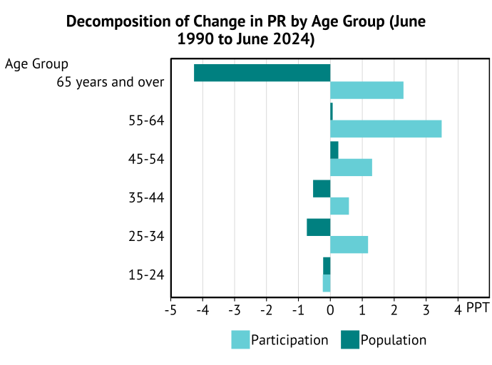
Age
This is pretty fun. The graph below shows us that - in the absence of rising labour force participation by age groups, we would have expected a FALL in labour force participation due to aging!
This is the "dark blue” line where participation rates are fixed at the level they were when listed at the top of the plot - so changes are only due to changes in the structure of the population.
So who has been the big driver of this drag on participation? It is all about increasing numbers of people being in “low labour force participation” age groups.


However, participation rates have risen. Why? A lot of age groups have simply participated more.
The above plot indicates that a lot of this increase in participation has been about 55-64 year olds. If their participation rate hadn’t changed since 1990, labour force participation would have been 64% before COVID and 65% now - compared to the the 66% or 67% we’ve observed.
Another way of saying this is that labour force participation has risen by 3.3ppts between 1990 and now, and increasing work force participation by those aged 55-64 has accounted for a large chunk of the increase.
We can go a bit further and work out all of these age based contributions stemming from changes in population shares and participation rates like so:
A growing number of people aging past retirement age is driving down participation rates, while growing participation by that group - and prime aged workers - has helped pull it up.
Now there are two other breakdowns I'd like to think about - household structure (including kids) and education. But my post is at max length, I'd have to find the data, and I'm running out of time before dinner.
Summing up
Let me give you my key take-away
Rising labour force participation has been a story of bucking trends - falling male participation and population aging would have dragged down participation, if it wasn’t that both older individuals and an increasing number of women had joined the labour force.
These same trends exist around the world - but while the downward pressures have dominated in the US, Australia has lead the rest of the world in pushing the other way.
How much can further gains in workforce participation from older and secondary earners be maintained? Why has male labour force participation retreated? Will automation encourage or discourage participation.
Don’t know - that’s where it is fun to do a bit of research to understand these questions a bit more. However, its been fun teasing out these trends - even if a lot of it has already been discusssed (cyclicality, against disability trends).
Now if you want to play around with this stuff, or update these things in the future, you can find the code that generates it right here. Don’t be too harsh on the code and lack of documentation, I’ve thrown it together on Sunday afternoon to procrasinate working on slides ;)
I directly downloaded and saved the Our World in Data data for dependency ratios, but everything else will automatically be pulled off the web (due to the OECD API, and Matt Cowgill’s readABS package in R).